+ An intro to Egg Brandpaks for upstarts.
Client:
Gaia (L’Oreal) & Atom
While we’d worked in the health & beauty market prior to EGG, “beauty” with innovation for Unilever (Think), & brand development and advertising for Dove, plus “health” with several other brands, including Nike (Women), based on the market’s massive size, scope and competitive complexity, we hadn’t considered it through the lens of new entry for a start-up. With the recent rise of several ecom-specific beauty brands (45 VC funded in 2017 alone), it was less surprising that two separate startups clients approached us at the same time in re: launching new brands in the space.
Typically, with start-up brandwork, based on budgets and our unusual capabilities, we seldom focus on “brand refreshes” or “fixing” individual elements (e.g. a logo). Nor do we approach it like an agency, with the goal of larger implementation projects. But given any client-focused “items” from logo to brand naming to tag-lines all come out–for us–“from scratch” after discovery and brand engineering work, we found a way to rework the model into what we named BrandPAKS that let us supply the 80% of the key impact signals, eliminate in-between work, and fit start-up 20% of standard budgets. Essentially all of the strategy and engineering pieces, with a set of key signals for identity and often one “implementation” piece, such as a package design for them to be able to repurpose across all brand signals internally.
Our goal in this case study is to show that essential process and output, but also the different approach we took for two separate companies in the same mega-market for contrast.
The first company was actually a newco created within L’Oréal’s tech incubator (NJ site) founded by a handful of L’Oréal R&D scientists armed with a proprietary formula for growing & enriching hair, which they wanted to productize for lash/brow treatment, then build a supporting product moat around that. They’d been referred to us specifically because they’d approached their own branding efforts as is too common, contracting out various pieces from name to logo-mark to tag-lines to independents who had little experience with the market or its customer segments. They came for a package design, by the time we finished that had a complete BrandPAK. During the same quarter, we were approached by another client who’d grown and sold several ecommerce properties, and wanted us to “create a new men’s grooming line brand.”
Though we’d initially engaged our Upstart clients for new product or IP work as the brand dev for these companies impacted the success of that work, we’d often “fix” an element here or there. However, unlike the original contractors that created pre-existing elements we spent several weeks in Discovery, and what we call Brand Engineering, not knowing how to “just design a logo” without that context before realizing these were unique practices for Upstarts, but ones that meant the difference between a new brand that has a shot at becoming an icon, and a pretty face that gets lost in the noise.
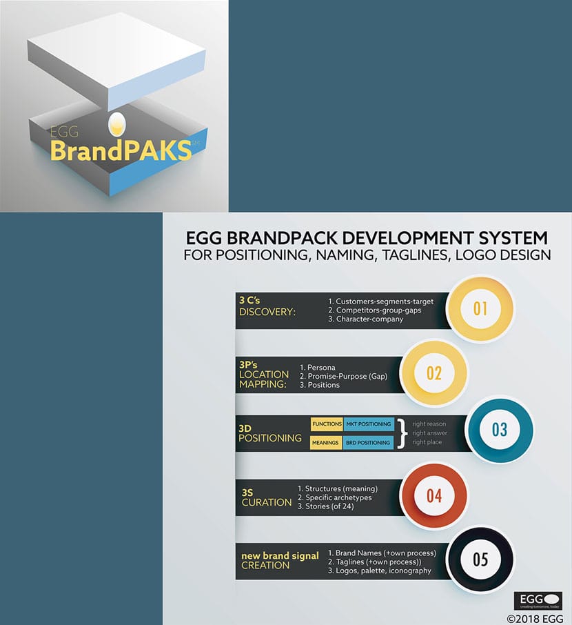
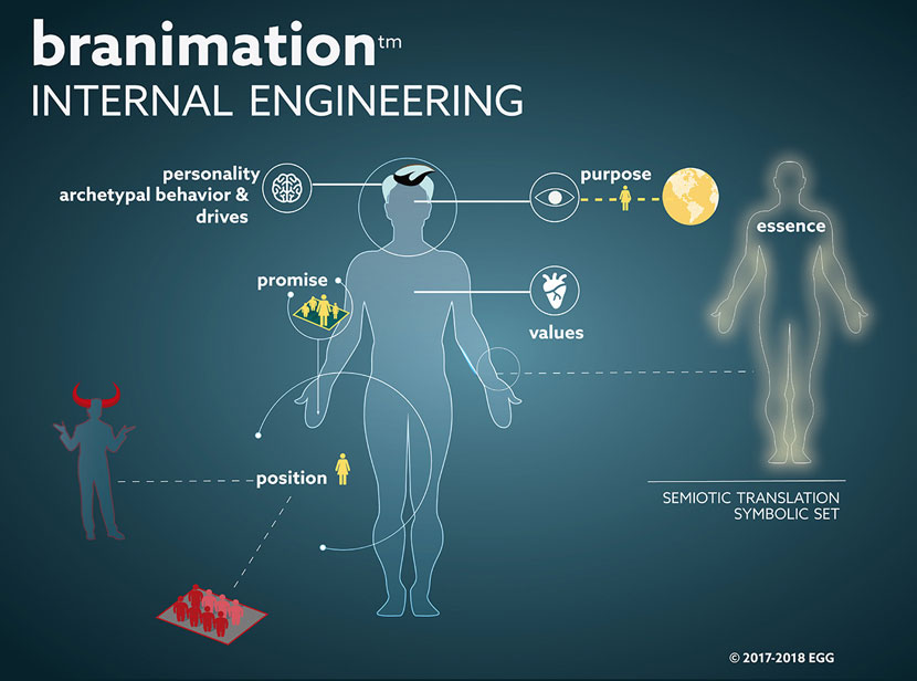
Much of the background in Brand Engineering is not formal Strategy, but work in Semiotics and Linguistics. Since Upstarts, understandably need to see “proof”, the external signals that come from this work are usually considered identity components, the most important, and directly interrelated being brand name, logomark symbol, and tag-line (from either UVP or EVP, the latter from Brand Purpose/Promise). To make it financially palatable to Upstarts, we packaged just these processes and outputs, often including one implementation piece for clients to re-purpose in the long term for other brand touchpoint design vs. being beholden to an outside agency to design new assets every time they needed (expensive).
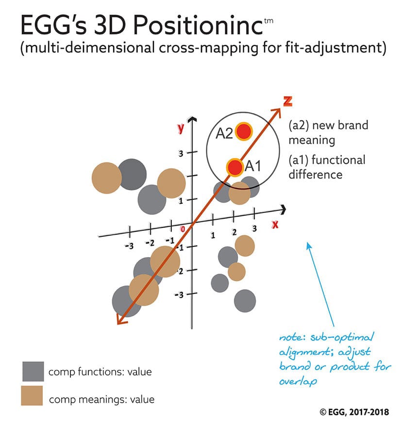
Our discovery areas are standard, with a few additional practices for deeper “customer insight,” including ethnographic studies we’d picked up from product design and development work, applied to brand innovation. However, we start with the larger industry before going into the specific market, and focus on both target consumer/customer discovery and competitive mapping and gap analysis specifically for our positioning (or repositioning) work, as we provide both market positioning and brand positioning, and an overlap for alignment, which we’ve named 3D Positioninc. For the purposes of brevity, we’ll share the customer target information here for Discovery.
With the women’s HBC NewCo, and their working title “Pure & Nourishing,” the main segments were bifurcated just as much by goals and culture as by age, and divided by core product purpose, with younger brands and their customers focused on traditional “enhancing beauty” yet with the obvious materials trend towards natural and ethically sourced ingredients.
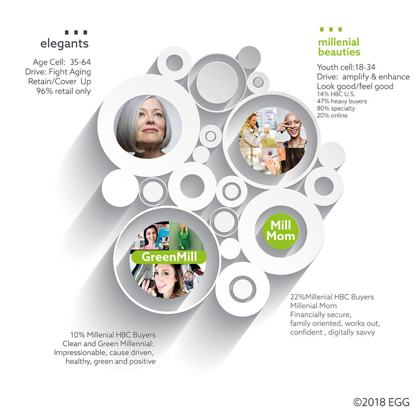
The other macro-segment, which demoed a shift in focus for older brands (and more towards “health maintenance”) were towards their aging core customer, young boomers and older Xers, with “anti-aging,” and supporting their value propositions through “scientific advances.”
From a few weeks of in-depth interviews, we gleaned enough data to put together a Persona for the client.
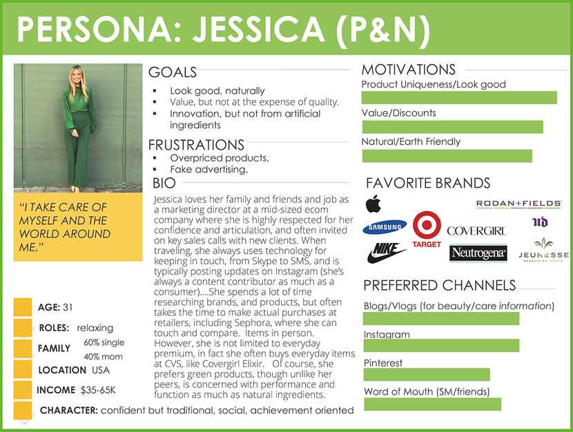
(For comparison, we created one for the traditional target segment as well — persona: Linda.)
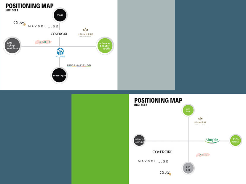
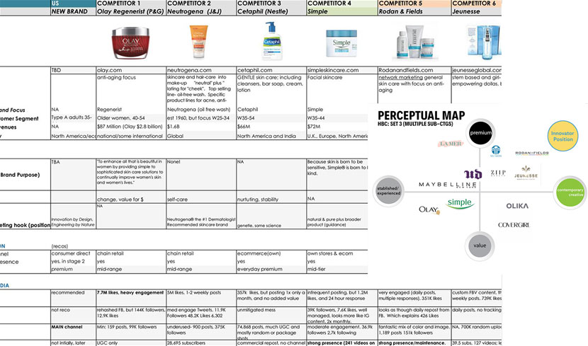
But the broader positioning was fairly clear, and as said, we provided both a market positioning map, and a perceptual map to ensure product and brand meanings were properly accentuated together and aligned.
As we were considering a few points of entry, we also added a comparison positioning map.
Special: New strategic segmentation
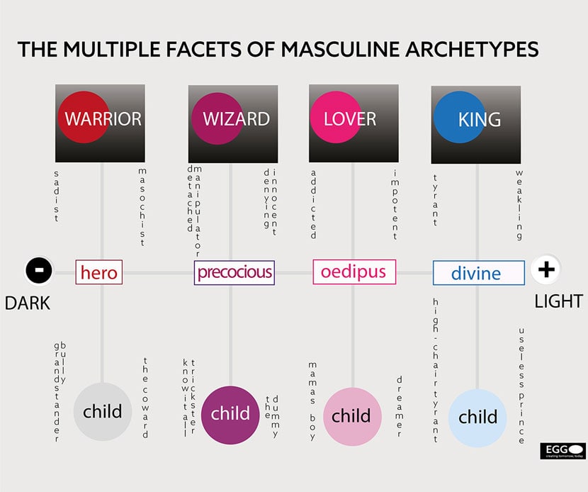
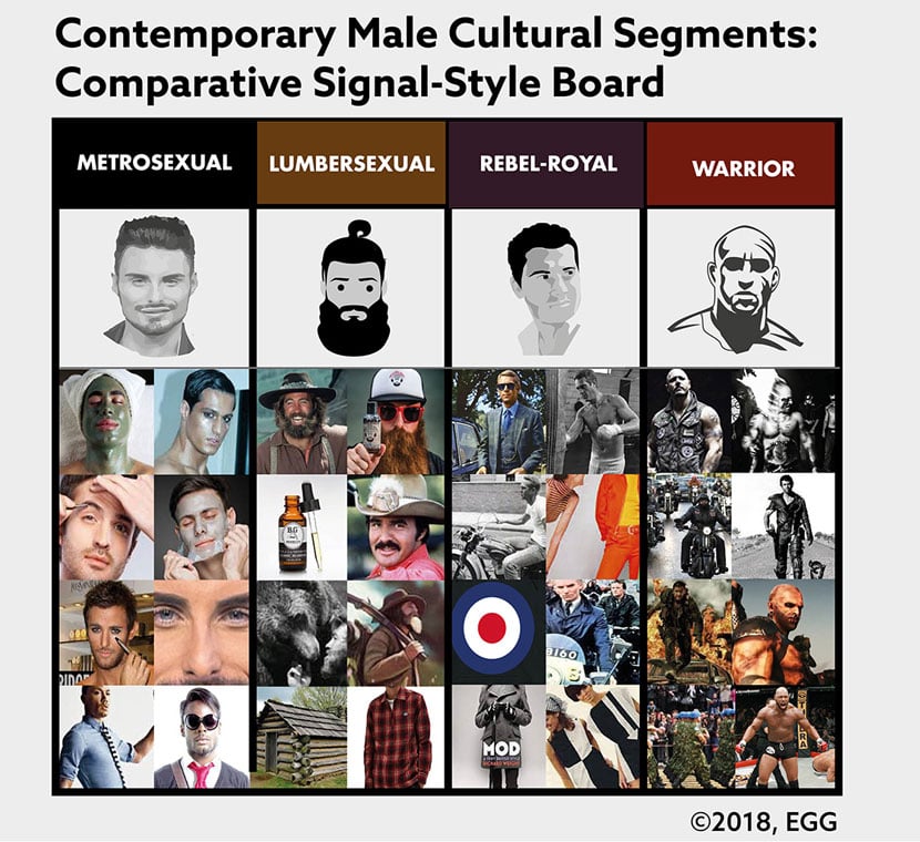
This discovery proved fascinating; as it was the first time we had to actually do a top-down (re)segmentation of the market. Sales figures proved there was an existing, and upward-trending market for a men’s grooming, but as of 2018, there was limited information on what the pre-existing consumer segments of “men buying HBC products” was, mainly because big brands, even Nivea, were assuming a brand extension (with “Nivea for men”) given the same core product needs could be achieved with a basic repackaging and new copy. But, just as we’d seen with working on Hagar almost 15 years before, “men” were now (still) seen as one segment, while culturally, there were (as we found) several self-identifying segments, and for once, co-existing across multiple generations! First, we went back to look at both the traditional archetypes associated with men, but then the various facets for archetypes based on life-stage and maturity (!)
Special: New strategic segmentation**
To “show” the client — as a “visual snapshot” — how individuated these various sub-segments were, culturally, we put together mood boards to show each before making a recommendation.
Targeting for a new “men’s” HBC brand was based on a model from almost 20 years ago that combined the unique attributes we saw, creating a model that
- different men from different segments would rally around as a brand tribe calling/association, and
- that could be resuscitated today for this brand.
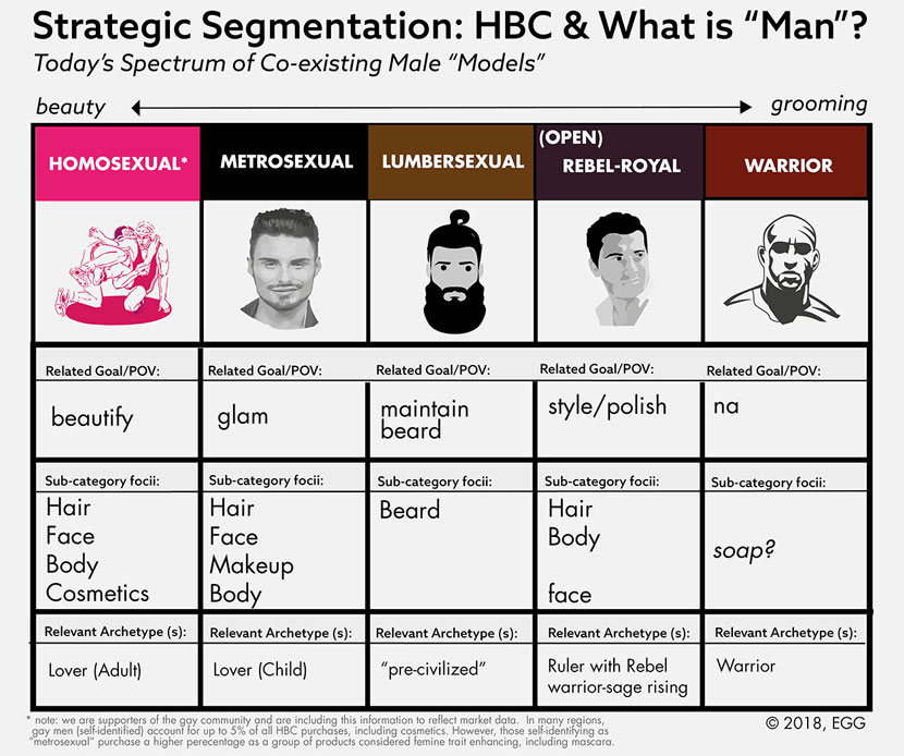
From our interviews with self-identified gay and metrosexual men (the biggest male buying segments of traditional HBC brands), they specifically trusted established women’s brands for their needs.
Warriors were less apt to consider even “men’s grooming” products, and the lumbersexuals were focused on beard maintenance and hygienic products (soap/shampoo); not the ideal for a “full-range” solution-oriented brand.
We do not include the dwindling “other,” the corporate/athletic segment, but see them as being attracted to a new men’s brand focused on the “rebel-ruler.”
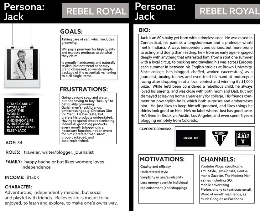
So, we developed a persona specifically for the Rebel Ruler.
For pure & nourishing, while we didn’t want to throw the baby out with the bathwater, but we suggested letting go of the current name and logo. But that we’d maintain and recreate some of the associated icons. As far as meanings, for this target, the literal function of promoting growth and richness for eyelashes and brows was important, but less so that it was a scientific breakthrough, such as for the older segment. The fact it was premised on natural materials was important.
We took baby steps with the name, but after determining the “roots” unique meaning, positioning, and unique combination of meanings, we generated over 100 new names, and presented a dozen that best represented each style of naming, starting with the ones that we thought would be considered more “traditional” (show groups).
For the brand name, we wanted to ladder up, to get to a higher spiritual/identity entry point, and include something aspirational. We’d come up with a couple of dozen names, but GAIA, which had not been used in the space, the name for the Earth Goddess, intersected with both “natural” and “iconic/spiritual”. The client loved it.
![]()
In wanting to create a brand palette with competitive separation, and specific meaning, we departed from the client’s logical, but “1 step” of meaning/association palette of green (“natural”), blue (“water-moisture”), and brown, these were also core colors overused in the category.
We also looked at less obvious examples of “natural” from microbiological lifeforms to hyper-saturated green images to bringing in earth-spiritual and supernatural elements (which the client loved).
The primary color we made was a mix to convey “thoughtful, cool & modern, but natural”, and it’s what we based the package flats on. (There is no Pantone color associated with it).

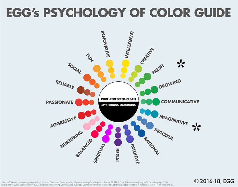
After discussing our goal for one primary unique brand color, but also avoiding the various overused and predictable literal greens, blues, and browns, the client suggested we select a single color that represented all of the associated meanings (from natural and vital, to pure and also calm yet energized).
Note: We use our own psychology of color guides, developed internally and in conjunction with the Society for Experimental Psychology and Cognitive Science (Washington, D.C.), made possible through a generous grant via SATOP.
We use a 6 phase brand naming process that combines techniques we learned from both brand strategy and copy-writing and product marketing worlds, enhanced by the core semiotics practice.
(More information in the names to logos collection.)
Typically, we spend a few weeks in developing roots from meanings, then building names, with a focus on neologisms (for both differentiation and trademark-ability purposes), but present the top 1–3 for each of 5 style categories of names, which we’ve found results in single client round selection.
![]()
In this case, we followed the client’s lead reworking “natural” based names while embedding a few that were more symbolic and appealing to the target’s imagination and spiritual associations.
We also start looking at the structure of the name and select logo-fonts for use in this naming round to give the client a head start.
As we’d hoped, the client selected the simple and iconic name “Gaia” to replace the working “Pure and Nourishing” name. Gaia is both the bio-science model for the earth as one single organism, but it is based on an earlier name for the Goddess of Earth.
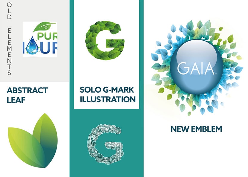
Before moving into integration work, the client had asked for us to update all of their primary icons, from water droplet (“moisture”) to implementing leaves in an icon outside the logo.
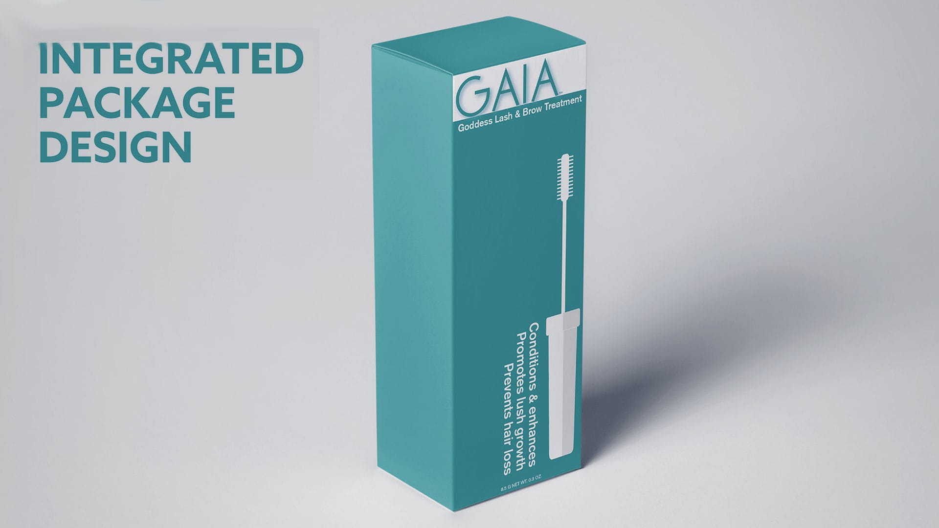
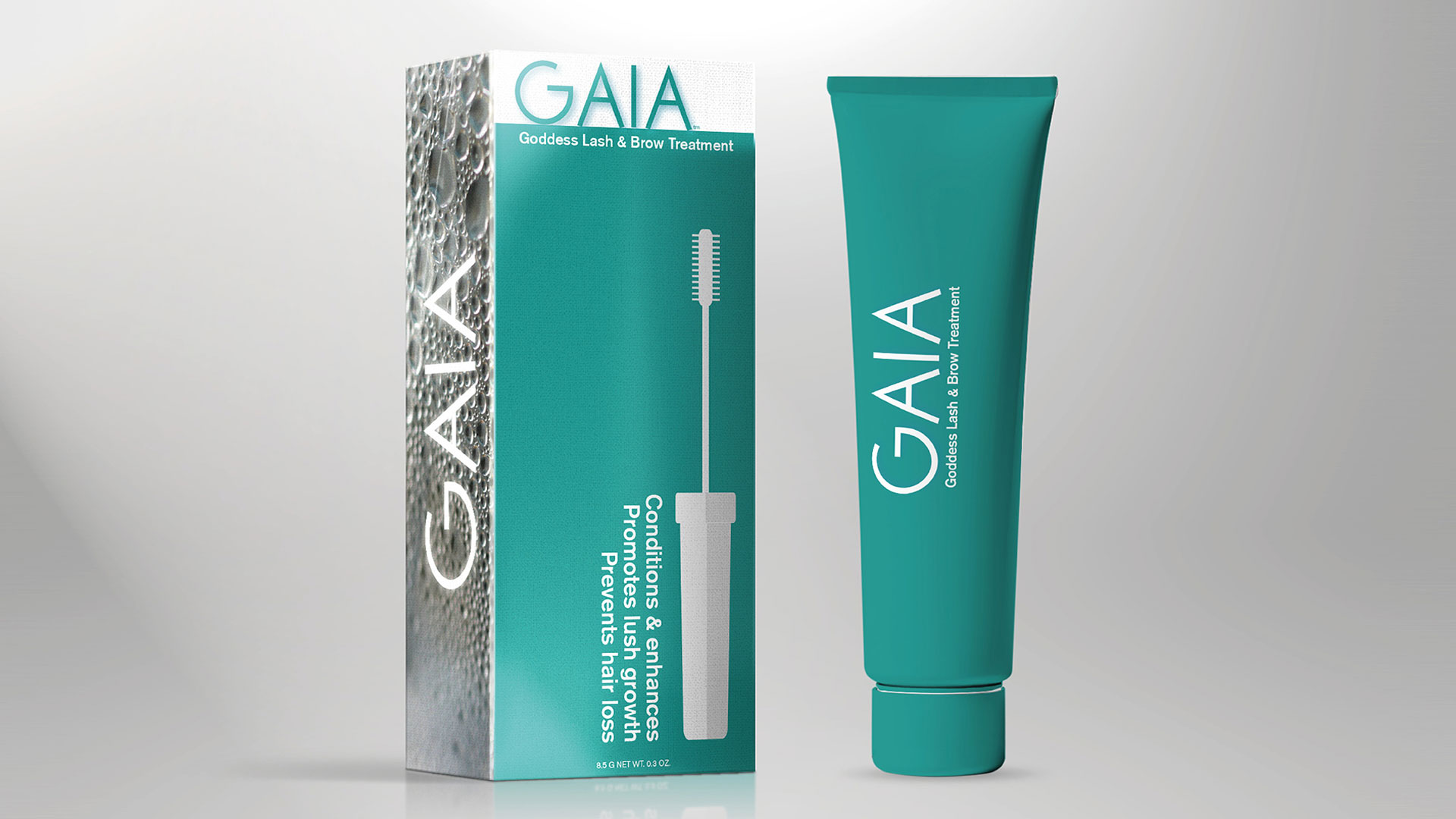
To integrate all of the elements, we created a leaf-by-leaf illustrated “G” mark (as a detachable mark), the minimalist GAIA logo-font, and an emblem for use in marketing materials, integrating all of those elements in one place.
We also used water and moisture photography, in abstract for the packaging design.
While the client wanted a “minimal” package, we were concerned, given their retail plans and the in-category trend of loud and informal packaging for their shared segment that it may get lost at shelf. However, we often use a Swiss Design style aesthetic for other projects, while we hadn’t seen it implemented in a package design, we felt it was perfect for its clean lines, use of typography as graphical element, and abstracted photography, and would stand out in the category while still appealing to minimalists. (It is a category filled with so much noise, this aesthetic, by comparison is radically minimal.)
We are – from training – not into providing a wide range of variations at this point to a client. A small handful, we believe, shows we’re doing our job in focusing on “the” right design, but we spend that time in iterating that core design until the client loves it.
But in package design, we look at the whole canvas then every individual signal, as a possibility for reinvention.
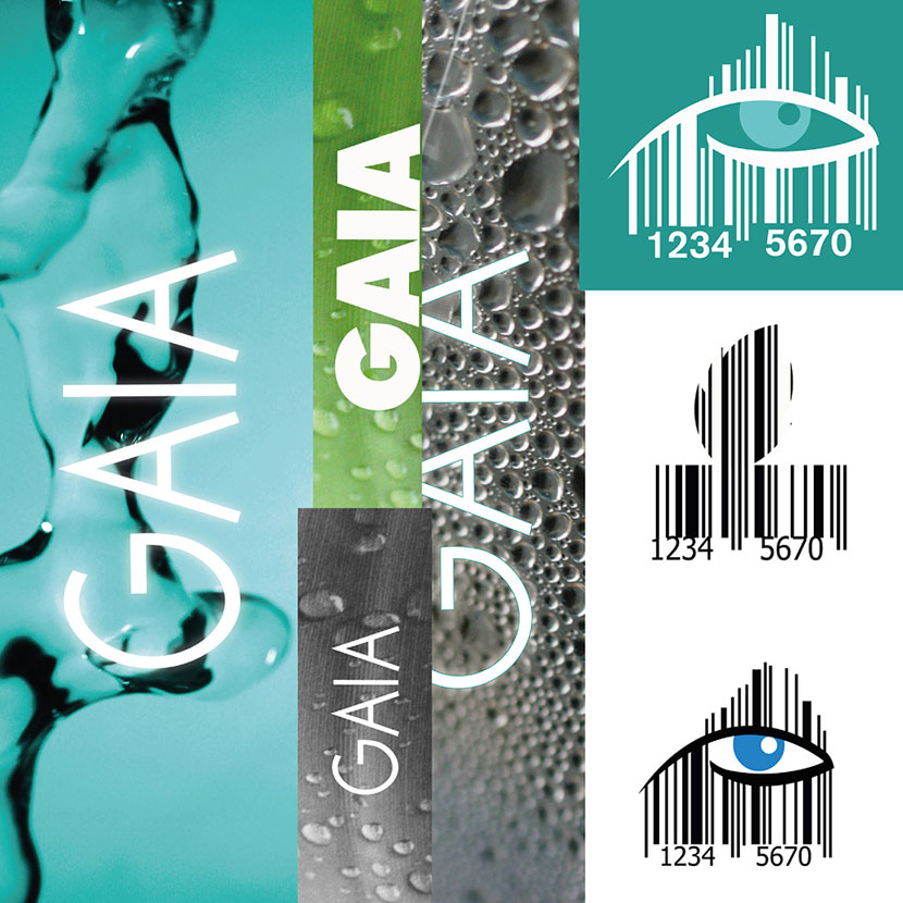
In this case, we brought in “moisture” through abstracting photos for a photo-panel, and even redesigned the company’s UPC so it was scannable but had shape, still scannable but now contributing to the package design.

The client had come up with “Menimal” for a “minimalistic” men’s brand. While we agreed with the thought-direction, we showed variations specifically “as if” we were pointing to the different segments we’d shown them weeks earlier.
For the palette, as a “minimal” canvas, black versus white was more obvious. Instead of multiple accent colors, we looked at one core brand color. Instead of the standard “fire engine” red, more common to “aggression” (or traditionals like Coke), we added more depth to convey “quiet confidence”.
This is a mock based on the client’s original name and a “minimal” package. One idea we’d added is in simplifying the information architecture (category, product type, product-alone).
![]()
The client had originally suggested a “full beauty line,” which to them included lip-care, and morning and night face products, specialized shampoos, etc.
But, part of the simplicity promise should be conveyed in product selection as well; instead of going the traditional SKU expansion route of older brands, trying to squeeze out every penny from their customers, we saw a better customer offering in combining core functions into individual products, and providing what was needed, and the premium it would command would off-set any incremental SKU income.
E.g., with face cream, which often is split by day and multiple functions, one face cream product that could be used in morning or night, for all men’s specific benefits: healing, moisturizing, and reducing razor burn.
As we like to show and share versus “tell” a client, instead of suggesting “Menimal” was too long and clunky and overt for a brand name, we showed how it would look on a package, and in different logo-font forms based on targeting different men’s segments.
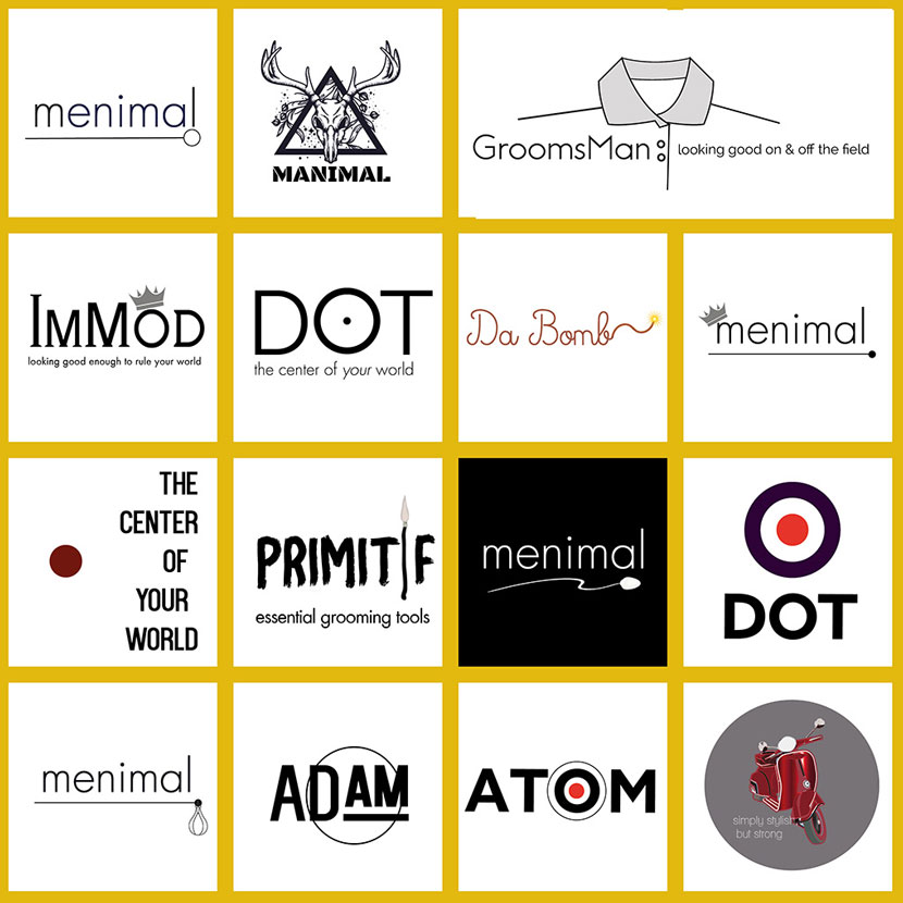
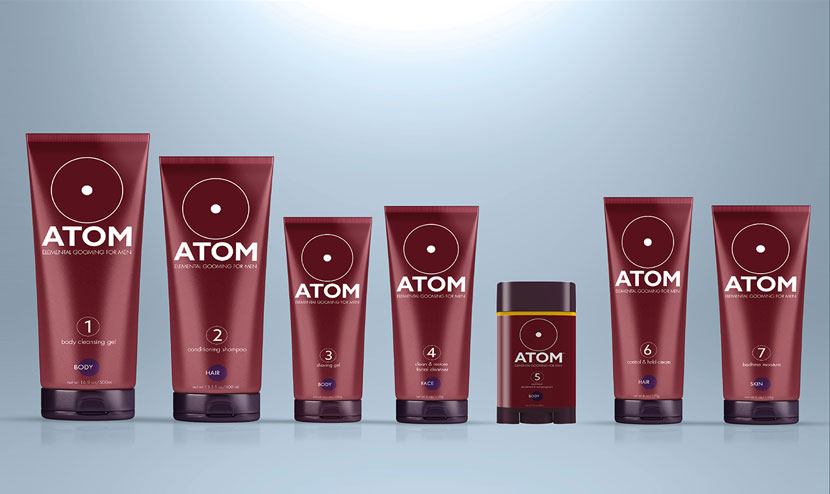
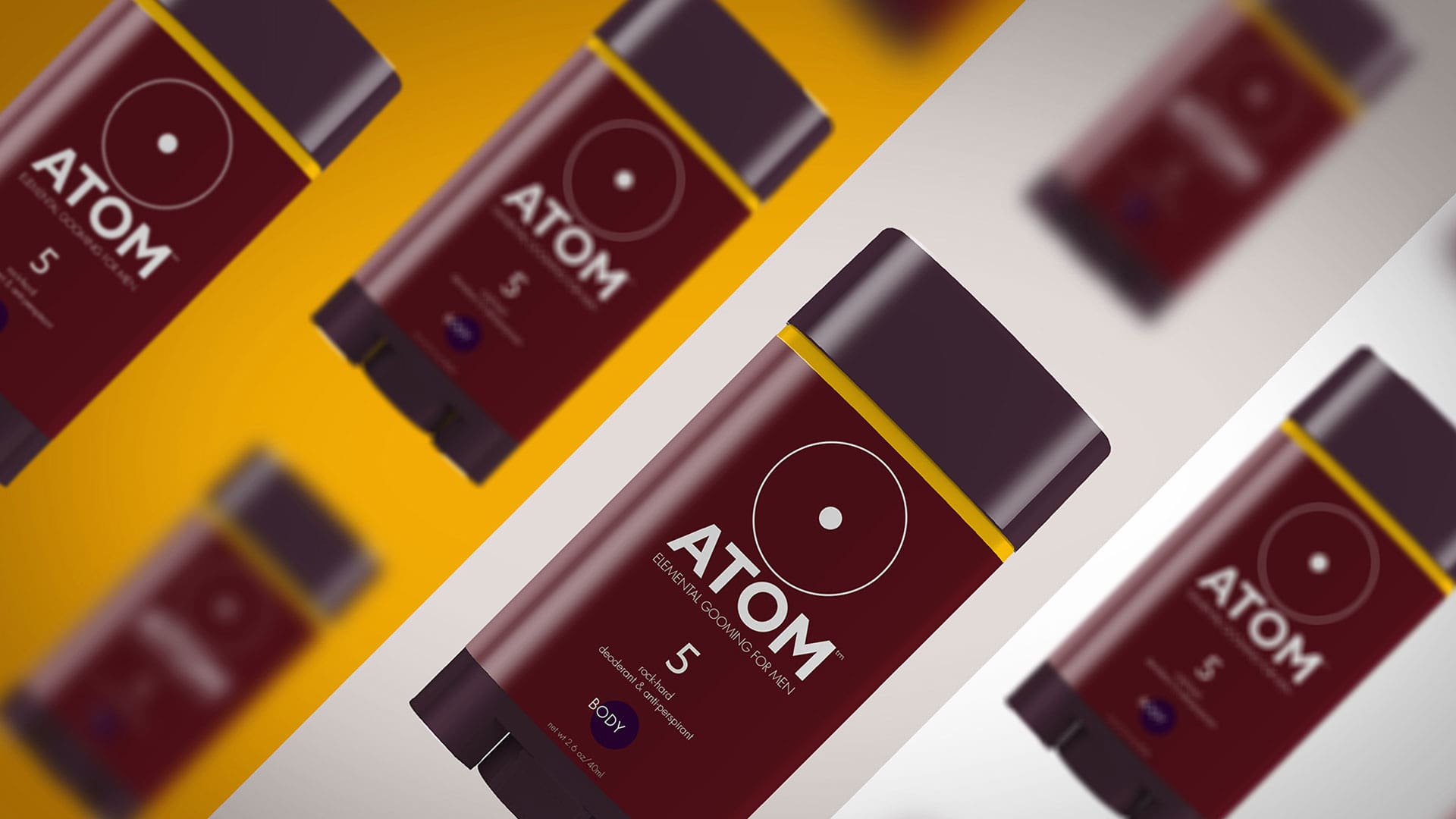
We’d also shown the extremely minimal name (“Dot”) which played well with the visual representations, which also gave us inspiration for the brand name “Atom”. As in the ultimate condensed essential component, but also a play on simplicity and “man”, with the original Man, “Adam” (“Atom, not Eve”).
We also minimized the original logo to be “atomic” and minimal, but powerful, and added one of the names from our own work to convey that.
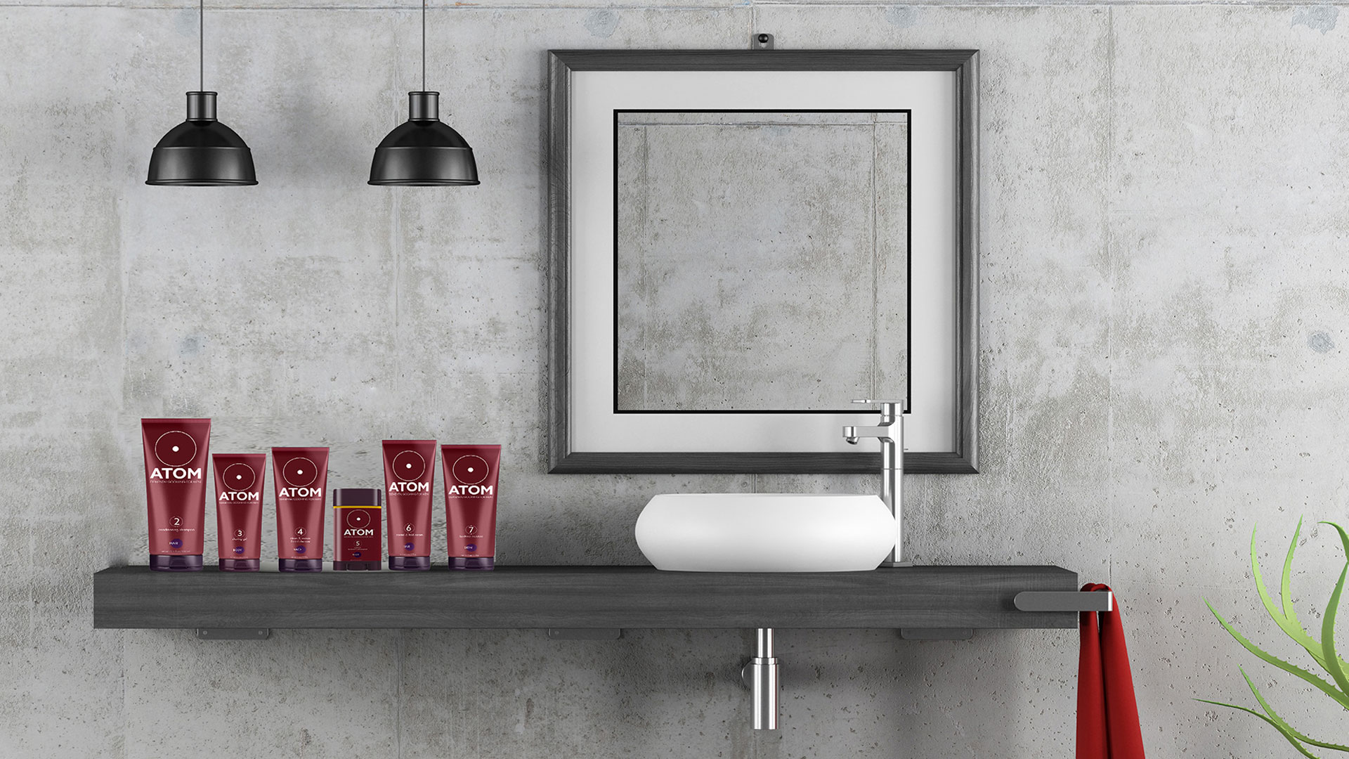
Seeing how this type of man wants simplicity even in storing, preparation, and product preparation (lining up, simple run through), and that all of these products could be stored in the same type of stand-up package, we redid a packaging presentation to reflect this simplified set.
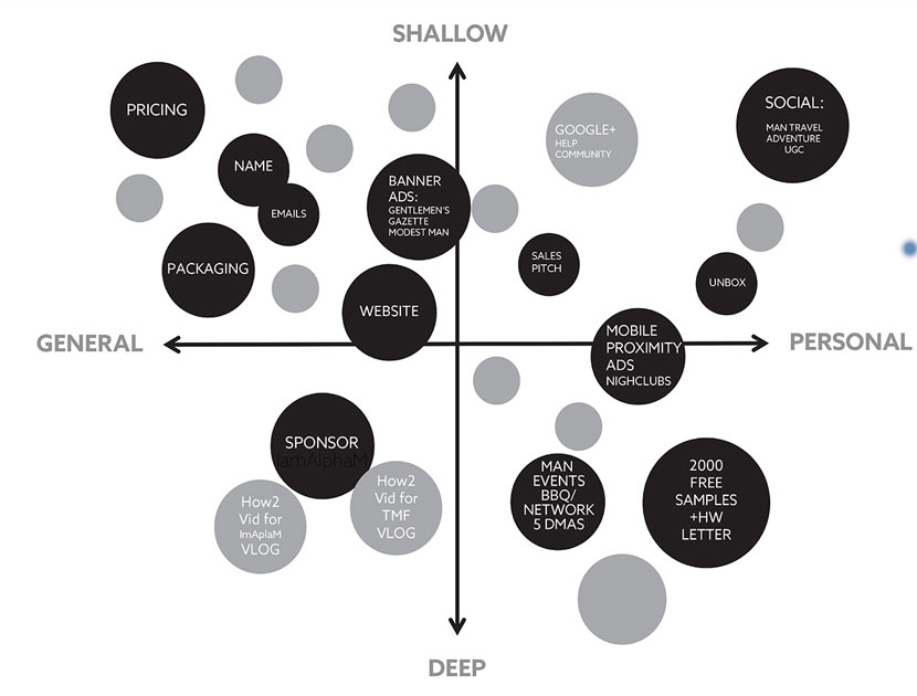
Given the client would be breaking completely new ground, we also provided a broader creative strategy and plan, and an initial touch point map with specific creative and marketing concepts to populate it.
Both companies are currently finalizing formulations for their last add-on products and have already started production on packaging and product for their initial completed products.