We work with brand agencies on a case-by-case basis either in brand niche areas (e.g. psychological signals) or in productizing client “ideas”. Sometimes we create more than initially asked for based on our process. In this case, we were asked to analyze the new Pepsi logo to do a “tear-down” and determine a better (and less expensive) approach based on the Pepsi’s strategy. In the process, we discovered a new patentable product line as the competitive differentiator for their targeted youth market to put the horse in from of the cart.
Client:
Anon
Analyze the “before and after” of the new Pepsi logo, redo our own brand road-map to determine a superior approach for recommendation by the agency. Core segment for focus: international youth beverage drinker.
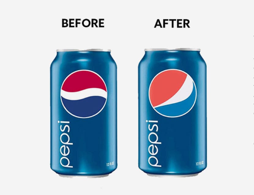
While Pepsi CEO Indra Nooyi was lambasted in the press for spending $1,000,000 on a Pepsi logo “update,” we were relieved that the reporters didn’t know that the design costs were less than a tenth of the actual operational costs in implementing a new logo across all touch points, from signage to literal cans for them.
We – and the agency we were hired by on this project – loved Pepsi as the rebel and challenger brand and knew there was a better way to maintain their core brand-legacy elements while making slight, but more psychologically meaningful changes to their original logo.
We did a 10 year trailing international competitive and internal review and projected 10 years into the future, including the standard consumer segment analysis, specific to segments that overlapped between top competitors and Pepsi.
We completed a brand audit looking at all the points and formats the current brand elements were utilized, including: brand inventory, (current vs desired) brand purpose & promises, any positioning statements, brand elements & associations, marketing support programs.
Exploratory work sparked a separate new proprietary product recommendation customized to the target audience. We did a deeper dig on Pepsi’s prioritized target sub-segment (the perennial youth market), interviewing sample members to generate persona guidelines.
We triangulated the best brand position for Pepsi that would resonate most with a (refined) target.
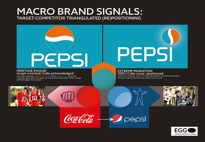
While Pepsi had tried casting a wide net with their “Coke alternative” audience in recent years, their core associations were wrapped around: diversity, creativity, and adventure; logical given Coke owned individualistic, aggressive, traditional, and simple in the category.
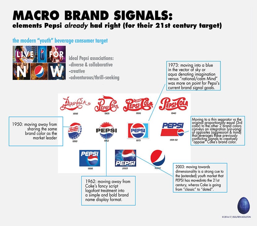
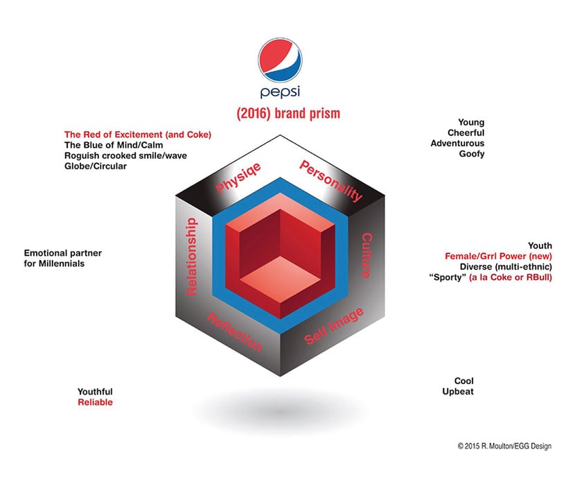
We analyzed the structural elements of some of Pepsi’s core brand signals, including, of course, their logo (pre and post Arnell), and compared elements with Coke as positioning reference for their target consumer. As Pepsi is the challenger brand, it is not surprising that it has gone through more brand adjustments than singer Pink has changed hairstyles. We analyzed the various psychological meanings behind all of these changes, some of which we wondered if Pepsi understood themselves given several of them were perfectly on-point for their current stated goals.
Pepsi’s most recent (pre-Arnell) incarnation had many elements on-point for their target customer, but glaringly off-position vs Coke. True strategic positioning is not binary (competitor facing alone), but triangulates based on optimizing attractors specific to the target customer (vs a competitor’s customers) and best stated difference vs competitor brand (the magic is finding differences that also appeal to the brand’s target customer, not just difference for difference’s sake which is the myopia borne of competitor-only positioning)…
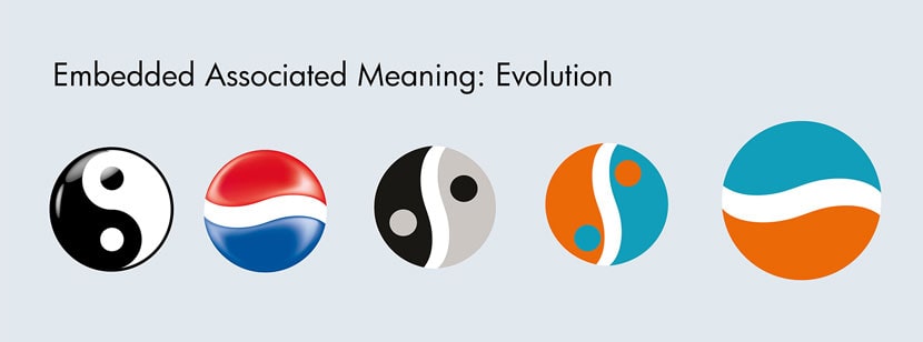
There were positive adjustments in Arnell’s work not cited by the press. For example, both of the core brand colors—as we will show—should evolve to better. While Arnell chose to maintain the original Pepsi blue in the logo-font (which makes sense as it provides higher contrast in most marketing areas), they chose to adjust the blue hue in the logo-mark, and in the right direction. In that instance, it would have been superior to transition to one single color (vs Coke) for physical clear counter-response instead of technically dividing the brand’s color meaning into 3 separate color hues.
Arnell also separated (for the first time) the Coke and Pepsi red color hues, and the direction of going towards orange was correct, away from aggressive competitive red and closer to social interaction.
The modification of the white wave (separator) was cleverly executed, though the wrong direction emotionally as far as reinterpretation vs. Coke’s aggressive stance. If Pepsi’s orientation in “youth” is creativity, social collaboration, exploratory/zest for life, a free-thinking grin is appropriate (active, celebratory), a roguish smile (aggressively defiant, reactionary), is specifically not. Regardless of the core idea, and the execution, the original element was already perfect, had the context changed. Whereas before, there was at least a perfect balance between the aggressive red and the calm mind blue, neither of which were separately on-brand for Pepsi, per their directives, at least they were balanced. The off balanced dominantly aggressive red signified the tables turning more towards a separatist, competitive Coke ethos with Pepsi utilizing the “black sheep” design element of the grin in the “e” of the Pepsi logo-font was clever, and we applaud it for that.

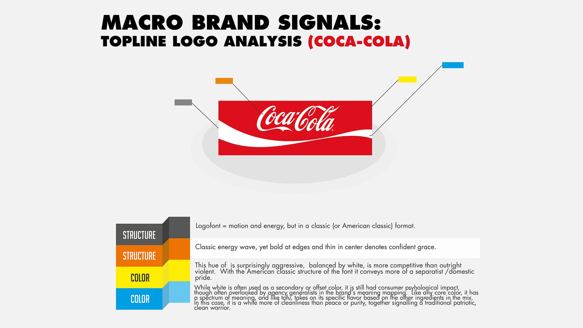
But as one of Coke’s core implementation weaknesses with its logo-font is its flowery script (and time consuming processing at retail or in outdoor for consumers and loyalists alike), moving towards a more contemporary and “transparent” sans-serif that could let the logo-mark do the heavy lifting, but the logo-font perform best in strict marketing environments was preferable.
Bottom line: Arnell’s brand-design thinking was clear in the actual work, though it was disconnected with both Pepsi brand strategy goals, and marketing tactic needs.
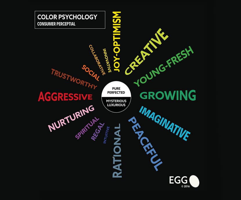
INRE: LOGO STRUCTURE, Pepsi already conveyed appropriate meaning, Coke is traditional but aggressive, appealing to the competitor (as a group). In fact, the dark side of “red” is anger and aggression, as are the hues Coca-Cola utilizes. Versus blood orange signifying passion to love. As we move from red to orange, this approaches general affection & social interaction with the darker tones of orange. Whereas Pepsi’s core colours, are culturally more associated with “rational mind/calm” but then also “aggression”.
A better balance would be between social adventure and excitement (orange) and imagination (light hue blue, versus big big blue of calm rationality). Pepsi has been aiming towards becoming the innovator and youth brand in the category, and their current structural messages were at the very least far more inclusive and international (celebrating variety and uniqueness of the individual by including differences).
Modifying the structural elements, while also appearing to replicate some of Korean Air’s brand DNA in the process, with a mischievous (or crooked, post-stroke) smile was a long step backwards. But an even deeper, and often overlooked consumer psychology trigger that should be modified was the brand’s core colour palette, evolved its meaning would be immediate and coordinated with Pepsi’s stated strategic brand goals.
Many associate Arnell’s failure with Tropicana’s rebranding with the modification of Pepsi’s logo, as if it was a general people & process at a specific time issue. And that $1 million to fix an element of the brand that wasn’t truly broken, a colossal waste.
Some marketers have forgotten Tropicana is owned by Pepsi, so the aggregate impact is more serious. What is not mentioned as clearly were the operational costs for Pepsi to transition their core logo and related brand signals across packaging and distribution, which was even more expensive ($tens of millions).
It is that larger cost, we believe, that should be used as the measure against impact.
The shifts we saw that were more important were at the product innovation area, not in a global re-brand around the same portfolio for a newer audience. And in that we were inspired.
(Please see Pepsi case in our “Development for IP Licensing” portfolio)